ZuraLog

ZuraLog

Brand Bible

The colours, type, shapes and interactions that make up ZuraLog on the web. Everything on this page is live. Move your cursor over it, scroll through it, and it behaves exactly as it does everywhere else on the site.

What makes it immersive

Immersion is not decoration. It comes from a handful of rules applied without exception, so the site behaves like one continuous object instead of a stack of pages.

01

Nothing moves at a constant speed

Every animation eases out of rest, runs quickly through the middle, then settles. It is the same curve a motion designer draws by hand, and it is why movement here reads as weight rather than as a computer counting frames.

02

Scroll is the control, not the trigger

Effects are tied to the wheel rather than fired once when a section appears. Scroll slowly and they move slowly. Scroll back and they run in reverse. You are scrubbing the page, not watching it.

03

It uses the whole screen, in every direction

Most sites are a column you push upward. This one works in depth and across as well as down: type large enough to fill the viewport, layers that move at different rates, surfaces that turn in perspective, and stretches that travel sideways while you scroll.

04

Sections bleed into each other

No hard cut from one panel to the next. Where the mood changes, the change is carried: colour eases through an intermediate tone, one section overlaps the next as it leaves. You should never catch the join.

05

Real material, not a grid of icons

Photography, footage and drawn artwork, made by people who were there. Generic iconography is the cheapest thing on the internet and it reads as such. What is genuinely made is the part that cannot be faked.

06

The page notices your cursor

Buttons lean toward you, letters dip and colour as you pass over them. Small reactions, everywhere, so the surface feels physical instead of printed.

07

There is no scrollbar

The scrollbar is browser furniture sitting on top of the work, and it constantly reminds you where the edges are. It is gone. Scrolling itself is untouched.

08

It is built for your screen, not a screen

Nothing here is pinned to a fixed pixel size. Type, spacing and layout are all expressed relative to the viewport, so an ultrawide monitor, a laptop, a tablet and a phone each get a composition that was meant for them.

09

One palette, one type system

Every colour, size and corner on the site comes from the short list further down this page. Nothing is chosen twice, so nothing drifts, and the whole product holds together.

10

Zura is present

The mascot is rendered live, frame by frame, and shifts with what it is doing. It is a character sharing the page with you rather than a logo parked in a corner.

Zura

Zura is the intelligence behind the product, and this is what it looks like. A shape that is never quite still, drawn with hard colour bands and ink lines rather than lighting, so it stays graphic rather than glossy. Its mood changes with what it is doing.

Resting

Waiting for you. Slow and quiet.

Thinking

Working on an answer. Faster, more broken up.

Talking

Answering. Bigger, sharper, more colour.

The opening

The first thing you see is not a panel placed on the page, it is a hole cut into it. The frame around it is the page itself showing through, which is why the hero has no edge to cross when you scroll past it. It opens in four movements and the page stays still until they finish.

Colour

A warm parchment canvas rather than white, with Deep Forest for anything you can act on and Sage as the accent. Surfaces separate by brightness, so panels sit on the page without needing a border or a shadow.

Surfaces

--color-ds-canvas

The page itself

--color-ds-surface

Cards and panels

--color-ds-surface-raised

Menus and hover states

--color-ds-surface-overlay

Dialogs and sheets

Brand

--color-ds-forest

Deep Forest, the primary action colour

--color-ds-forest-pressed

Pressed and active

--color-ds-sage

Sage, the signature accent

--color-ds-sage-soft

Soft sage fills

--color-ds-warm-white

Warm white

Text

--color-ds-text-primary

Headlines and body

--color-ds-text-secondary

Supporting copy

--color-ds-text-tertiary

Placeholders and disabled

--color-ds-text-on-forest

Type on a Deep Forest fill

Status

--color-ds-success

Success

--color-ds-warning

Warning

--color-ds-error

Error

Health categories

Each area of your health owns a colour, and it is the same colour everywhere it appears: a card, a chart, a ring, a label.

--color-ds-cat-activity

Activity

--color-ds-cat-sleep

Sleep

--color-ds-cat-heart

Heart

--color-ds-cat-nutrition

Nutrition

--color-ds-cat-body

Body

--color-ds-cat-vitals

Vitals

--color-ds-cat-wellness

Wellness

--color-ds-cat-cycle

Cycle

--color-ds-cat-mobility

Mobility

--color-ds-cat-environment

Environment

Typography

Two typefaces with two jobs. Clash Display is the loud one: a neo-grotesk with apertures pinched almost shut, which is what gives it punch at headline scale without leaning on tracking to get there. General Sans does the reading, including every number.

Clash Display

Aa Gg Rr 0123456789

Headlines and anything meant to fill the viewport. One variable file covering Extralight through Bold, so its thickness can be animated rather than switched.

General Sans

Aa Gg Rr 0123456789

Body copy, labels and every metric. A rationalist grotesk with a double storey a and small, orderly apertures, built to stay quiet at small sizes.

The scale

Eleven sizes, and nothing outside them.

Zura reads your day

up to 68px · The pillars section headline only

Zura reads your day

up to 48px · The pillars section's card titles only

Zura reads your day

34px · Hero numbers and page titles

Zura reads your day

28px · Section headers

Zura reads your day

24px · Card headlines

Zura reads your day

20px · Card titles

Zura reads your day

17px · List titles

Zura reads your day

up to 32px · The pillars section's card descriptions only

Zura reads your day

16px · Primary body copy

Zura reads your day

14px · Descriptions

Zura reads your day

12px · Captions and timestamps

Zura reads your day

15px · Buttons

Zura reads your day

13px · Chips and tabs

Zura reads your day

11px · Badges and units

Space and corners

One spacing scale built on eights, and one set of corner radii, both shared with the mobile app. A card here and the same card on your phone breathe the same way.

Spacing

2px
4px
8px
16px
20px
24px
32px
48px

Corners

8px

Chips and tags

12px

Inputs

16px

Tiles

20px

Cards

28px

Sheets and panels

100px

Pill buttons

Motion

Nothing here moves at a constant speed. Every animation eases out of rest, runs quickly through the middle and settles softly, the way a physical object would. Scroll driven effects are tied to the wheel, so you are scrubbing them rather than watching them play.

Pull me

Magnetic

Move your cursor near it. It leans toward you, then springs back.

Zura reads your day

Letter dip

Run your cursor along the words. Each letter drops and colours as you pass it.

StepsSleepNutrition

Scroll reveal

Scroll this in and out of view. It follows the wheel in both directions.

Pieces

The parts the site is assembled from. Each one carries its behaviour with it, so a button feels the same wherever it turns up.

Buttons

Three weights, for how much attention an action deserves.

Optional.

Form field

One labelled control. Give it choices and it becomes a picker.

Data retention

We keep personal data no longer than needed for the purpose it was collected for. You can delete your account at any time.

  • Health and fitness data, for the life of your account
  • Deleted content, erased within 30 days

Long form text

How the policies read: one column, wide margins, links you can actually spot.

Sizes and shapes

Two heights and two corner treatments.

The mark

One shape, any colour, any size.

Download on the App StoreGet it on Google Play

Store badges

Official Apple and Google artwork, never redrawn.

ZuraLog running on an Android phone

Phone

Where app footage plays. Android is drawn in CSS, iPhone is artwork, both to one matched size.

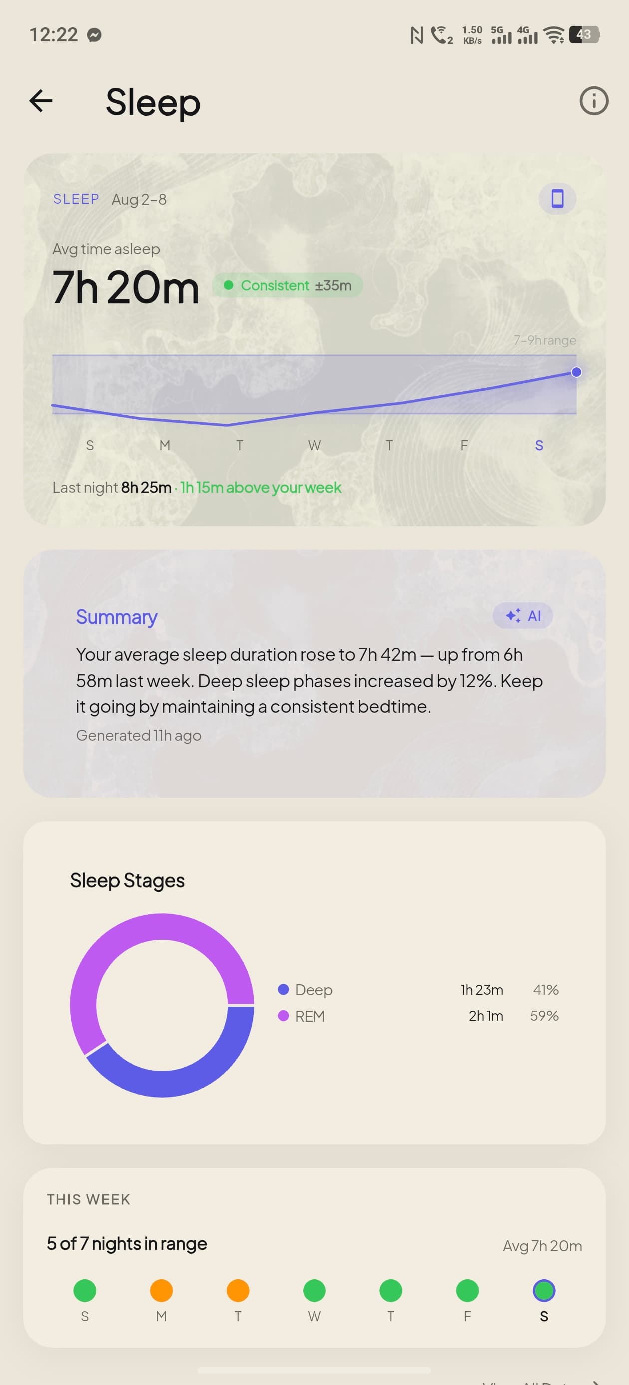
Sleep

Sleep stages and time asleep, every night, so you know what actually rested you.

The Sleep screen in ZuraLog, showing sleep stages and time asleep

Pillar showcase card

A health pillar sold in one card: name, what it does, the real screen doing it. The gradient tints toward that pillar's category colour.

Our story
The builders
What we stand for

Eyebrow

The chapter apparatus: label, optional numeral, optional hairline. Scenes draw the line by scroll; at rest it is simply there.

A portrait drifting gently against the scroll
The same portrait with twice the travel

Parallax frame

A photograph drifting inside its own window as you scroll, so it reads as sitting behind the page. Higher travel, deeper depth.

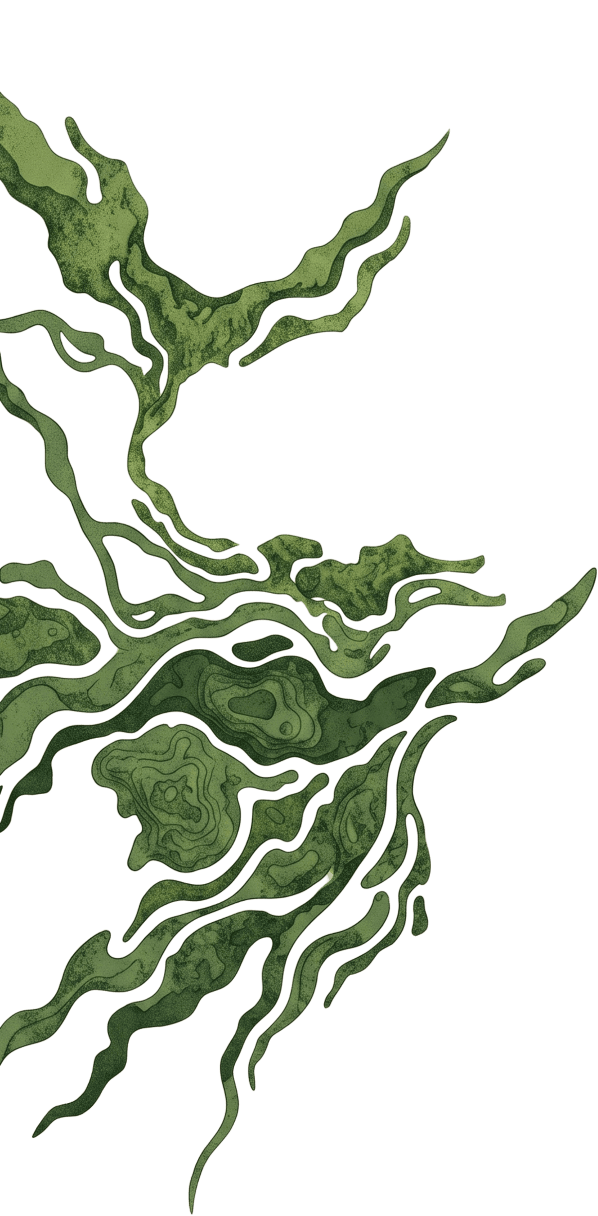
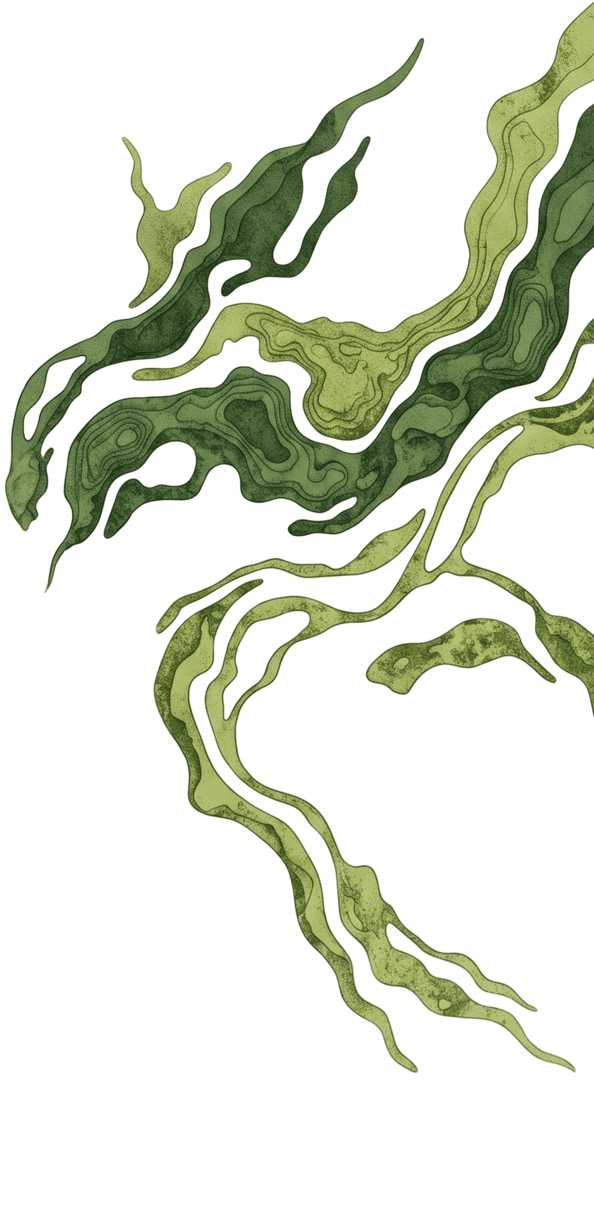
Topographic backdrop

The two ink clusters that frame a closing section, flush to the edges. The homepage CTA and the About epilogue both mount this.

Accent block

A flat colour panel offset behind a photo or mockup, the editorial depth trick. The image sits proud of it; it never touches the pointer.

Route changes ride PageTransition: a sheet of canvas fades over the outgoing page, the new one mounts behind it, and it fades away. Follow any link on this page to see it.

Whole pages

Three shapes cover everything that is not the landing page. Each one is a single piece the routes are poured into, so a change to any of them lands everywhere at once.

  • A standard page

    The navigation, then the content, then the ending. On the landing page the bar is welded to the hero and rides up with it; here it is an ordinary header that scrolls away, which is why body copy never slides underneath it.

  • A policy

    Title, the date it last changed, and the document. The terms, the privacy policy, the cookie policy and the account deletion page are all this one shape.

  • A card from an email

    Where a password reset or an email confirmation lands. One card, one job, no navigation to wander off into. Opened without a live link it says so, which is what you will see here.


The ending

Every page finishes the same way. First everything you might be looking for, in one block: what this is, how to reach us, where to get the app, and every page on the site. Then the sign off. The name grows up out of the floor letter by letter as you scroll, a dark panel rides up over it, and Zura crests the join. Scroll back and the whole thing sinks again, because it follows your position rather than playing at you. It is directly below.

Colour, type and spacing values are named tokens rather than fixed values, so a change here reaches every page at once. Reference names look like --color-ds-forest.